Free
Example result — yours keeps your own face.
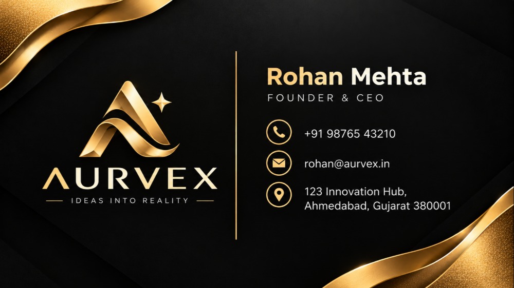
Professional Organic Food Business Card | AI Image Prompt
Explore a professional organic food business card design featuring essential contact information, business details
2 views♥ 33 savesAdded
Prompt · 1,946 words
Create a **high-quality NORMAL/FREE single-sided visiting-card image** using the complete design specification below.

IMPORTANT: This is a **customer-facing IMAGE GENERATION prompt**. The final user will not have access to the original inspiration card, so recreate the entire visual design from the written instructions only.

Before generating the card, first ask me **ONLY for the information actually required by this specific design**.

Ask me for:

1. Company / Brand Name
2. Company Tagline / Slogan — optional
3. Company Logo — ask me to upload it only if I have one
4. Person Name
5. Designation / Job Title
6. Phone Number
7. Email Address
8. Business Address

Do not ask for website, social media, QR code, second phone number, GST number, registration number, profile photo, or any other information not required by this design.

If I answer “no,” “skip,” “none,” leave a field unanswered, or do not provide a detail, **continue with generation using only the information I supplied**.

CRITICAL MISSING-FIELD RULE: If any contact detail is not provided, remove that entire item completely, including its text, icon, label, row, placeholder, and reserved gap. For example, if no email is supplied, do not show an email icon or empty email row. Rebalance the remaining elements naturally so the layout still looks intentional, aligned, and professionally designed.

Never invent, guess, autocomplete, replace, or fabricate missing business information.

If a logo is uploaded, preserve its exact wording, symbol, proportions, and recognizable identity. Do not redesign, distort, crop, stretch, recolor, duplicate, or replace it. If no logo is supplied, do not invent one. Instead, create a clean, elegant **non-branded abstract emblem area** that does not imply a fake company identity, or use the company name typographically as the brand element.

After receiving the available information, immediately generate the final visiting-card image according to the following specification.

## CARD FORMAT

Create **ONE single-sided horizontal visiting card**.

Aspect ratio: **7:4**.
Orientation: horizontal landscape.
Presentation: flat, straight-on, edge-to-edge visiting-card artwork.
The artwork must fully fill the canvas like a finished printed business card.

Do not create a square image, poster, flyer, vertical card, folded card, mockup, desk scene, card held in a hand, floating card, perspective view, or multiple cards.

## OVERALL DESIGN STYLE

Create a refined, luxurious corporate visiting card with a **matte charcoal-black background** and **metallic gold decorative accents**.

The visual feeling should be:

- premium but restrained
- elegant
- modern
- corporate
- confident
- clean
- high-end
- professional
- visually balanced

Although this is a Normal/Free design, make it feel exceptionally polished through strong typography, spacing, composition, and tasteful gold detailing rather than excessive complexity.

## BACKGROUND

Use a full-bleed **deep charcoal-black to near-black background** with a subtle soft tonal gradient.

Add extremely subtle dark geometric shading or layered black shapes in the background to create depth, but keep them understated.

Do not use busy patterns.

A very light fine-grain texture may be present to simulate premium matte printed card stock.

## GOLD CORNER DECORATION

Create elegant **layered metallic-gold wave shapes** entering from two opposite corners:

- upper-left corner
- lower-right corner

Each corner treatment should contain approximately 2–3 overlapping curved layers.

The waves should have smooth flowing contours, with a tasteful gradient ranging from warm champagne gold to deeper amber-gold.

Use realistic but restrained metallic highlights and soft shadow separation between the layers.

The gold waves should partially extend beyond the canvas edges so the artwork feels naturally full-bleed.

Do not create exaggerated liquid-metal, plastic, chrome, or bulky 3D effects.

## MAIN COMPOSITION

Divide the card visually into three areas:

### LEFT BRAND AREA

Occupies approximately **40–43% of the card width**.

### CENTER DIVIDER

A thin vertical metallic-gold line.

### RIGHT INFORMATION AREA

Occupies approximately **48–52% of the card width**.

Maintain generous negative space around all elements.

The layout should feel balanced rather than crowded.

## LEFT BRAND AREA

Place the brand identity approximately in the center-left portion of the card.

If a company logo is uploaded, display it prominently here.

If no logo is uploaded, use the company name as the primary brand element and optionally add a tasteful neutral abstract emblem above it only if it does not invent a brand identity.

The reference visual language uses a soft gold emblem above the company name, so preserve this general hierarchy:

1. Logo / emblem
2. Company / Brand Name
3. Tagline, if supplied

### LOGO / EMBLEM TREATMENT

The logo zone should be visually dominant within the left area but should not become oversized.

If using a supplied logo:

- maintain its original proportions
- provide clean breathing room
- keep strong contrast against the black background

If the logo color permits adaptation only through natural presentation, retain the uploaded logo faithfully rather than redesigning it.

### COMPANY NAME

Place the company name below the logo.

Use uppercase or title case according to the exact supplied capitalization.

Typography should be a clean modern sans-serif, medium-to-semibold.

Use warm metallic gold or muted champagne-gold.

The company name should be clearly readable but smaller than the person's name on the right if both are present.

### TAGLINE

If supplied, place the tagline immediately below the company name in much smaller text.

Use muted warm-gold or soft off-gold.

If no tagline is supplied, remove it entirely and tighten the spacing naturally.

## CENTER DIVIDER

Place one thin vertical gold line between the brand section and contact-information section.

The line should:

- be approximately 1 px visually
- not touch the top or bottom edges
- start around 20–24% down from the top
- end around 78–82% down from the top
- use muted metallic gold
- act as a subtle visual separator

Do not make it thick or overly bright.

## RIGHT INFORMATION AREA

Place the person's information in the right half of the card.

The entire information group should be vertically centered.

Use clean left alignment.

### PERSON NAME

Place the person's name near the upper portion of the information block.

Make this the strongest text element on the card.

Use a sophisticated modern sans-serif font.

Recommended characteristics:

- medium or semibold weight
- clear letterforms
- refined proportions
- slightly compact spacing

Use warm champagne-gold.

The name should be noticeably larger than all supporting text.

Preserve the supplied name exactly.

### DESIGNATION

Place the designation directly below the name.

Use a smaller size and lighter weight.

Use muted gold or soft warm gray-gold.

Maintain close but comfortable spacing between the name and designation.

If no designation is supplied, remove the line entirely.

## CONTACT DETAILS

Below the name and designation, create a clean vertical contact list.

Only show the contact fields actually provided.

Possible rows:

- phone
- email
- address

Each visible contact row should use:

- a small refined gold outline icon on the left
- the exact supplied information on the right
- consistent icon-to-text spacing
- consistent vertical rhythm

Recommended icon style:

- thin-line
- minimal
- elegant
- visually consistent
- no filled icon circles
- no decorative backgrounds behind icons

Use familiar icons such as:

- handset or phone icon for phone
- envelope icon for email
- location pin for address

Do not show an icon for a field that the user did not provide.

### CONTACT TEXT STYLE

Use a small clean sans-serif font in soft off-white, pale warm gray, or subdued champagne.

Keep text highly legible.

Do not make contact text excessively tiny.

Use comfortable line spacing.

If the address is long, wrap it neatly into a maximum of approximately two lines while maintaining alignment with the other contact entries.

## TYPOGRAPHY HIERARCHY

Maintain this hierarchy:

1. Person Name — strongest individual text
2. Company / Brand Name — strong brand text
3. Designation
4. Contact details
5. Tagline

Use no more than one primary sans-serif type family with carefully controlled weights.

Avoid decorative script fonts, serif display fonts, handwritten styles, novelty fonts, excessive italics, or condensed unreadable type.

## COLOR SYSTEM

Use approximately:

- Background: near-black / charcoal black
- Primary metallic accent: champagne gold
- Secondary gold: warm muted amber-gold
- Main small text: soft off-white or warm pale gray
- Secondary small text: muted gold-gray

Keep the palette cohesive.

Do not introduce unrelated bright colors.

## SPACING AND ALIGNMENT

Use professional print-design discipline.

Maintain consistent internal margins of roughly **5–7% of the card width** from the outer edges.

Keep all important text safely inside the card.

Do not place text too close to the gold corner waves.

Preserve generous negative space.

Align all right-side contact information to the same left edge.

Maintain consistent spacing between rows.

Do not fill every empty area.

## PRINTED-MATERIAL FEEL

The final image should resemble a professionally designed matte business card.

Use subtle material realism only:

- refined metallic sheen on gold elements
- soft printed-card texture
- clean matte black surface
- realistic tonal separation

Do not turn it into an exaggerated photorealistic mockup.

The artwork itself must remain flat and ready for presentation.

## EXACT TEXT PRESERVATION

Reproduce every supplied text field **exactly as entered**.

Preserve:

- spelling
- capitalization
- punctuation
- spaces
- email spelling
- phone-number formatting
- address wording
- job title wording
- company name
- tagline

Never paraphrase supplied text.

Never correct, rewrite, shorten, embellish, or translate user-provided content unless explicitly requested.

## AI TEXT-QUALITY REQUIREMENTS

All visible text must be:

- correctly spelled
- sharp
- readable
- properly aligned
- non-overlapping
- complete
- not cropped
- not duplicated
- free from gibberish
- free from malformed characters

If text cannot be rendered reliably, prioritize clean accurate typography over ornamental effects.

## RESPONSIVE MISSING-DATA BEHAVIOR

The layout must adapt intelligently to the amount of supplied information.

Examples:

If only phone and email are supplied, show only two rows and vertically rebalance them.

If only phone is supplied, show only the phone row and naturally position it under the designation.

If no contact information is supplied, remove the entire contact list and preserve a clean, intentional information block rather than showing empty icons or blank rows.

If the company tagline is not supplied, remove it and reduce the gap beneath the company name.

If no logo is supplied, do not leave an obvious empty logo box.

The card must always look intentionally designed rather than incomplete.

## NEGATIVE CONSTRAINTS

Do NOT create:

- square or vertical layout
- wrong aspect ratio
- poster or flyer
- 3D visiting-card mockup
- perspective distortion
- rounded card floating on a surface
- multiple cards
- front-and-back sheet
- QR code
- social-media icons unless explicitly supplied and required
- website row
- extra contact fields
- fake company information
- invented slogan
- random logo
- empty icons
- empty contact rows
- placeholder text
- lorem ipsum
- visible field labels such as “Phone:” or “Email:” unless part of the supplied text
- excessive gold decoration
- thick divider line
- excessive beveling
- oversized shadows
- plastic or chrome gold
- blurry typography
- warped text
- gibberish
- duplicated details
- cropped text
- watermark
- stock-image branding
- unnecessary border around the full card

## FINAL QUALITY TARGET

Generate a polished, commercially usable **Normal/Free single-sided visiting card** that closely follows this visual system: matte black luxury background, elegant champagne-gold corner waves, centered left-side branding, thin gold vertical divider, and refined right-side personal/contact information.

The result should feel sophisticated and professionally art-directed while remaining simple enough for a Normal/Free design.

The finished image must look like a **complete real visiting-card artwork**, with excellent typography, exact supplied business information, disciplined spacing, attractive hierarchy, clean gold detailing, balanced negative space, and no visible indication that any missing fields were omitted.
How to get the best result
- 01📸 Upload one clear, well-lit face photo as the identity reference.
- 02😊 Keep the original facial features and natural skin texture.
- 03✨ Use ChatGPT or Gemini image generation and pick the highest quality.
Pro Want even more detailed prompts?
Unlock every Pro prompt from ₹99 — no auto-renewal.
Keep exploring
More visiting cards prompts.
Visiting Cards
Black & Yellow Modern Business Visiting Card | AI Image Prompt
Free
Black & Yellow Modern Business Visiting Card | AI Image Prompt
Visiting Cards4
Visiting Cards
Food & Spices Business Visiting Card
Free
Food & Spices Business Visiting Card
Visiting Cards2
Visiting Cards
Purple Minimal Business Card | AI Image Prompt
Free
Purple Minimal Business Card | AI Image Prompt
Visiting Cards2
Visiting Cards
Professional Law Firm Business Visiting Card | AI Image Prompt
Pro
Professional Law Firm Business Visiting Card | AI Image Prompt
Visiting Cards1
Visiting Cards
Professional Coffee Shop Business Visiting Card | AI Image Prompt
Free
Professional Coffee Shop Business Visiting Card | AI Image Prompt
Visiting Cards1
Visiting Cards
Professional Company Business Card | AI Image Prompt
Pro
Professional Company Business Card | AI Image Prompt
Visiting Cards1
Visiting Cards
Luxury Fashion Boutique Visiting Card |AI image prompt|
Pro
Luxury Fashion Boutique Visiting Card |AI image prompt|
Visiting Cards1
Visiting Cards
Orange Wave Business Card | AI Image Prompt
Free
Orange Wave Business Card | AI Image Prompt
Visiting Cards1